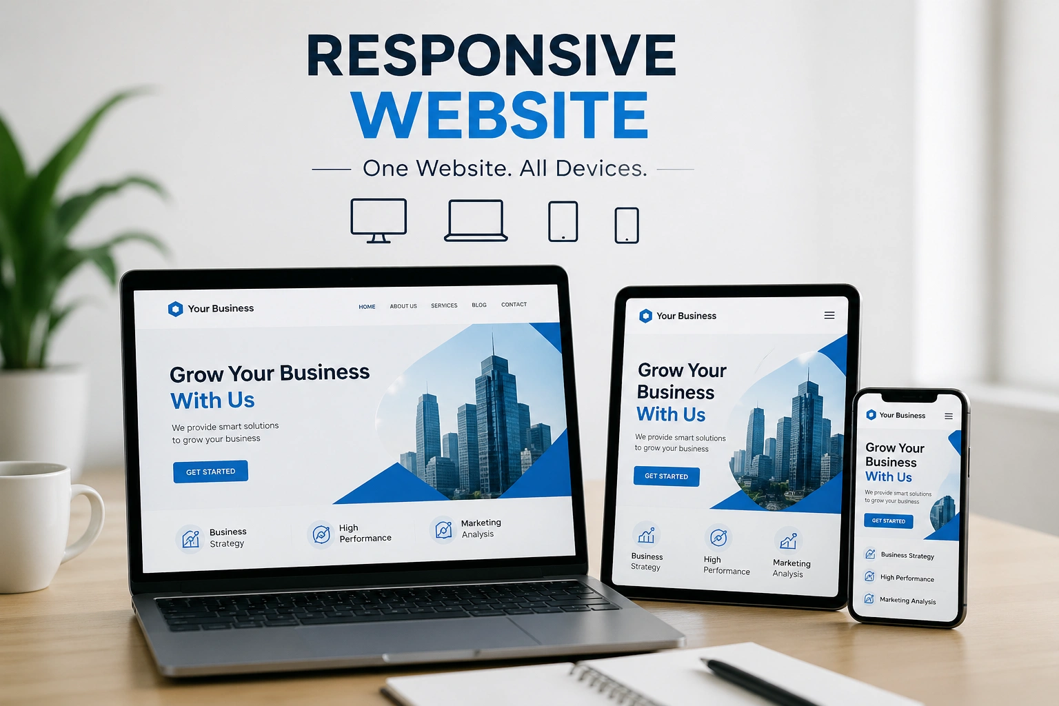
Why Every Business Needs Responsive Website
In today’s digital world, users access websites from multiple devices including smartphones, tablets, and desktops. A responsive website ensures your business looks professional and functions smoothly on every screen size.
Without a responsive design, you risk losing visitors, reducing engagement, and damaging your brand credibility.
1. Better User Experience
A responsive website automatically adjusts layout, images, and content to fit all devices, providing a seamless experience for users.
2. Improved SEO Rankings
Search engines like Google prioritize mobile-friendly websites. A responsive design helps boost your rankings and visibility.
3. Increased Mobile Traffic
Most users browse on mobile devices. A responsive site ensures you capture and convert this growing audience effectively.
4. Faster Loading Speed
Responsive websites are optimized for performance, improving loading speed and reducing bounce rates.
5. Higher Conversion Rates
When users can easily navigate your site on any device, they are more likely to take action—whether it's making a purchase or contacting you.
6. Cost Effective Solution
Instead of maintaining separate desktop and mobile websites, a responsive design allows you to manage a single website efficiently.
7. Strong Brand Image
A modern, mobile-friendly website builds trust and presents your business as professional and up-to-date.
Conclusion
A responsive website is no longer optional—it’s essential for business success. It enhances user experience, improves SEO, and drives better results across all digital platforms.